בחזרה לבלוג←
פרופיל לינקדאין לדוגמא: ככה נראה פרופיל שמביא לקוחות ב-2026
חניתה יודובסקי


הפרופיל שלכם הוא דף נחיתה לקונה אחד. לפני ואחרי אמיתי, בפנים.
אמל"ק: פרופיל לינקדאין שמביא לקוחות בנוי כמו דף נחיתה לקונה אחד. ארבעה חלקים עושים את רוב העבודה: כותרת (עד 220 תווים, ובתגובות רואים בערך 60), תמונת רקע, פתיחת האודות (בערך 300 תווים לפני ״ראה עוד״) וסקשן Featured. במאמר שלוש דוגמאות עם טקסט לפני ואחרי לכל חלק: פרופיל אמיתי של לקוח (גל שלומאי, בהסכמתו), ועוד שתיים מורכבות להמחשה, מייסד סייבר ויועץ תמחור, ורשימה של מה לתקן השבוע.
פרופיל לינקדאין לדוגמא שבאמת מביא לקוחות נראה כמעט הפוך ממה שרוב האנשים בונים. רוב הפרופילים שאני פותחת נכתבו למגייסת שמחפשת עובד, והאנשים שבנו אותם מזמן לא מחפשים עבודה, הם מחפשים לקוחות. אז הכותרת אומרת ״מנכ״ל ומייסד ב-X״, האודות מתחיל ב״בעל ניסיון של 15 שנה״, ותמונת הרקע היא נוף מהטיול ליוון.
אני מלווה מנכ״לים ומייסדים, ולחלקם אני גם כותבת את הפוסטים (ghost writing), וכמעט בכל ליווי חדש הדבר הראשון שאני פותחת הוא הפרופיל. לא הפוסטים, הפרופיל. כי כל פוסט טוב שולח אנשים לשם, ואם מה שמחכה להם שם הוא קורות חיים, הפוסט עבד לחינם.
לפני שנתחיל, שתי הבהרות. הדוגמה הראשונה היא פרופיל אמיתי של לקוח שלי, גל שלומאי, שאישר לפרסם אותו כאן בשם ובצילומי מסך. שתי הדוגמאות האחרות הן דמויות מורכבות שבניתי להמחשה, לא אנשים אמיתיים (אני לא מצטטת פרופילים של לקוחות בלי רשות, וגם לא של זרים). ומגבלות התווים משתנות מדי פעם, אז שווה לבדוק בחשבון שלכם לפני שמעתיקים.
למה רוב הפרופילים נראים כמו קורות חיים (ולמה זה עולה לכם בכסף)
כי ככה לינקדאין נולדה. עד לפני כמה שנים הפרופיל היה קורות חיים עם כפתור ״התחבר״, והתבנית נשארה בראש של כולם גם אחרי שהפלטפורמה הפכה למקום שבו קונים ב-B2B בודקים מי עומד מאחורי ההצעה.
והמספרים של 2026 מראים כמה זה כבר לא עניין של יופי. חברת Meltwater ניתחה 9.5 מיליון ציטוטים של מנועי AI (ChatGPT, Gemini, Copilot ועוד) ומצאה ש-75% מהציטוטים של תוכן לינקדאין מגיעים מפרופילים אישיים, ורק רבע מעמודי חברה (Meltwater, 2026). באותה שנה Metricool מדדו 673,658 פוסטים מ-63,108 חשבונות ומצאו שפרופילים אישיים מגיעים לשיעור מעורבות גבוה ב-63% מעמודי חברה, 2.60% מול 1.60% (Metricool, 2026). כתבתי על זה בהרחבה במאמר על לינקדאין כערוץ מכירות, והשורה התחתונה שם זהה: הנכס הוא הפרופיל האישי.
עכשיו תעקבו אחרי מסע של קונה אחד:
ראה תגובה חכמה שלכם בפוסט של מישהו אחר ← קרא את הכותרת (בערך 60 תווים, זה כל מה שמוצג שם) ← לחץ על השם ← שלוש שניות על תמונת הרקע והכותרת המלאה ← החליט אם לגלול ← קרא שתי שורות של אודות ← הקליק על משהו ב-Featured ← או יצא.
בכל תחנה במסע הזה קורות חיים מפסידים. ״מנכ״ל ומייסד״ לא אומר לקונה כלום על מה שיש לו להרוויח, ו״בעל ניסיון של 15 שנה״ עוד פחות.
האנטומיה של פרופיל לינקדאין שמוכר: חמישה חלקים, לפי סדר הקריאה
הסדר כאן הוא סדר הקריאה של המבקר, לא הסדר שבו לינקדאין מציגה את השדות בעריכה.
כותרת (Headline). עד 220 תווים, אבל בתגובות, בבקשות חיבור ובתוצאות חיפוש מוצגים בערך 60 עד 70 הראשונים (AuthoredUp). כלומר 60 התווים הראשונים הם הכותרת האמיתית, והשאר הוא בונוס למי שכבר בפרופיל. הנוסחה שאני עובדת איתה: למי + מה התוצאה + הוכחה קצרה. תואר ושם חברה נכנסים בסוף, אם בכלל.
תמונת רקע. החלק הכי מוזנח וגם הכי זול לתקן, יש לו סקשן משלו בהמשך.
פתיחת האודות. השדה מאפשר 2,600 תווים, אבל רק בערך 300 מוצגים לפני כפתור ״ראה עוד״ (אותו מקור). זה המקום להתנגדות שלי לרוב המדריכים: הם משקיעים 80% מהמילים באודות, ובפועל האודות הוא החלק שהכי פחות אנשים קוראים עד הסוף. שתי השורות הראשונות חייבות לעבוד לבד, וכל השאר הוא למי שכבר משוכנע חצי.
סקשן Featured. שלושה עד ארבעה פריטים מוצמדים: פוסט אחד שהביא שיחות, דף אחד באתר, ומשהו אחד להורדה או לצפייה. פריט ש״נראה טוב״ ולא מוביל לשום מקום מבזבז מקום.
ניסיון. כן, הוא נשאר. אבל כל תפקיד מקבל שורה או שתיים על מה עשיתם, על תוצאות שהגעתם אליהן והישגים משמעותיים, ולא על מה הייתם אחראים.
ועכשיו לדוגמאות. הראשונה אמיתית, מהעבודה שלי עם גל, השתיים האחרות דמויות מורכבות, וכל החלקים בהן כתובים כמו שהייתי כותבת אותם ללקוחה אמיתית.
דוגמא 1 (אמיתית, בהסכמתו): גל שלומאי, מומחה קמפיינים ממומנים
גל הוא לקוח שלי, והוא אישר לפרסם כאן את הפרופיל שלו בשם ובצילומי מסך. ישראלי שגר בניוקאסל, מנהל קמפיינים ממומנים בגוגל, מטא וטיקטוק. הפרופיל הקודם שלו פנה לעסקים בבריטניה, והיה בנוי כמו רוב הפרופילים של אנשי פרפורמנס: כותרת גנרית ובאנר עם מספרים גדולים. ההחלטה שלו הייתה לחזור לקהל ישראלי.
כותרת, לפני: I fix ad accounts that leak money | Paid Ads for UK Businesses | Google, Meta & TikTok
כותרת, אחרי: Paid Ads Strategist for Israeli SMBs burned by agencies | ROAS reports won't pay your bills. Revenue will. | No results in 30 days = full refund
הגרסה הראשונה נקייה, ובדיוק בגלל זה היא נראית כמו עוד אלף פרופילים של מנהלי קמפיינים. ״עסקים בבריטניה״ זה לא קהל, זה מדינה. בגרסה השנייה, ב-60 התווים הראשונים, בעל עסק ישראלי שנכווה מסוכנות רואה את עצמו במילים: Israeli SMBs burned by agencies. אחר כך מגיעה דעה (דוחות ROAS לא משלמים חשבונות), ובסוף היפוך סיכון (אין תוצאות ב-30 יום, החזר מלא). הכותרת ארוכה יותר, וזה בסדר, כי כל חלק בה עושה עבודה אחרת.
ומילה על השפה. הכותרת של גל נשארה באנגלית גם כשהקהל ישראלי, וזה מתאים לעולם שלו, פרפורמנס וטק, עולם שחי באנגלית גם בישראל. הכלל שאני עובדת איתו: אם הקהל או הלקוחות שלכם בינלאומיים או מעולמות הטק, אנגלית זה נכון. אם הקהל ישראלי ודובר עברית, שווה לשקול לכתוב את הכותרת בעברית, כי היא מדברת אליו בשפה שהוא קונה בה.
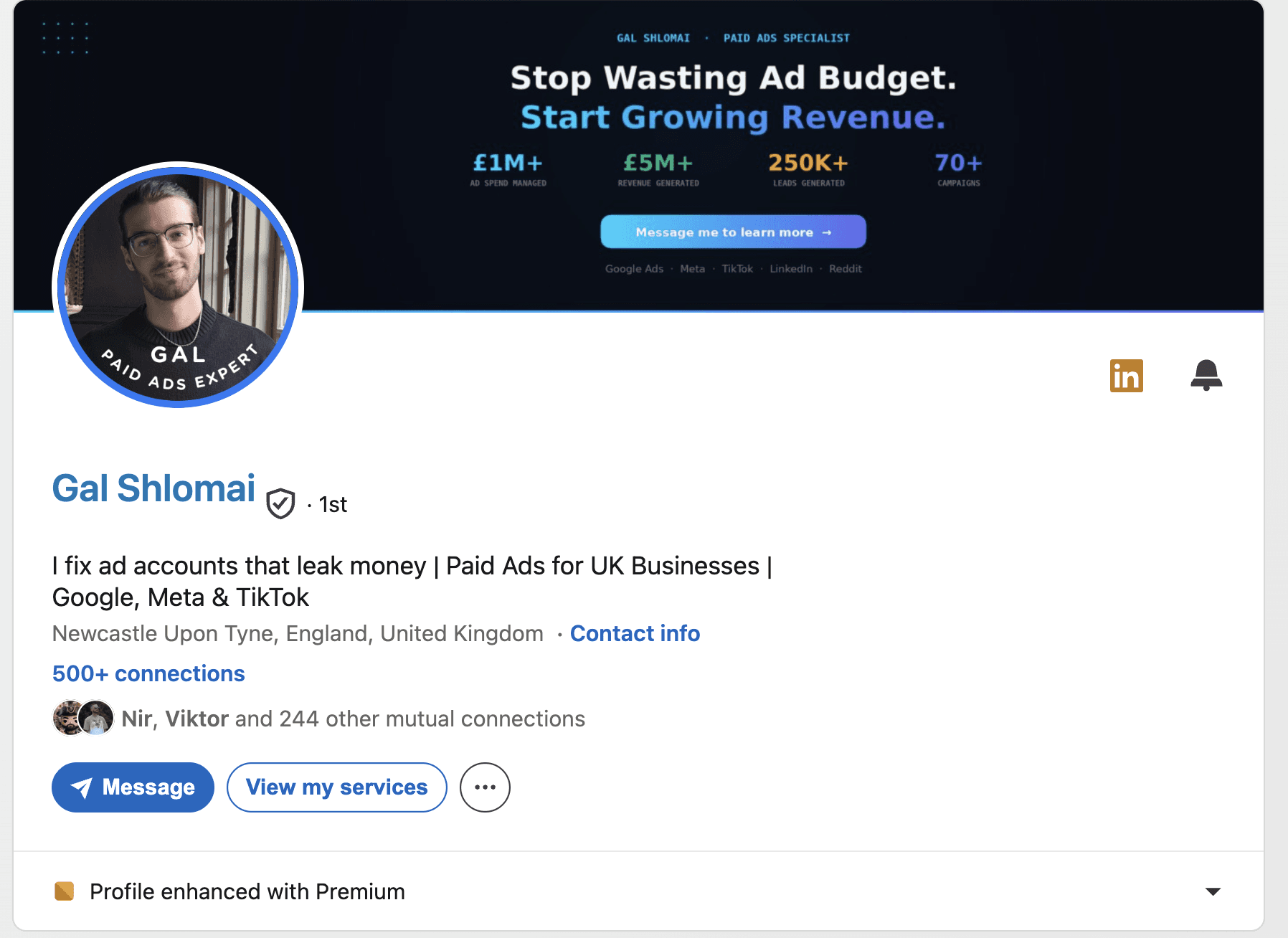
תמונת רקע, לפני: רקע שחור, כותרת (Stop Wasting Ad Budget. Start Growing Revenue.), ארבעה מספרים (תקציב מנוהל, הכנסות, לידים, קמפיינים) וכפתור ״Message me״. נראה מקצועי, ולא אומר למי. ארבעה מספרים בלי קהל הם קישוט.
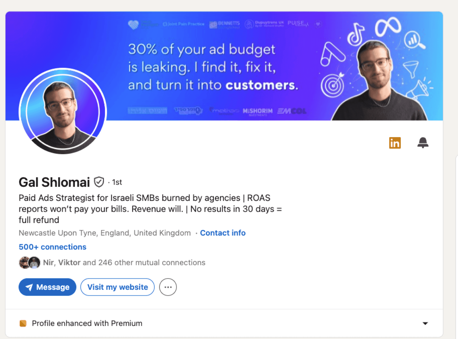
תמונת רקע, אחרי: רקע כחול, משפט אחד במרכז, ״30% מתקציב הפרסום שלכם דולף. אני מוצא את זה, מתקן, והופך את זה ללקוחות״, לוגואים של לקוחות ישראלים למעלה ולמטה, ואייקונים של הפלטפורמות. הלוגואים קטנים, ובכל זאת הם שם, כי לקהל ישראלי הוכחה מקומית שווה יותר ממספר גדול. הבאנר עונה על השאלה שהכותרת פתחה: אם 30% דולף, מי כבר סמך עליו לסגור את זה.
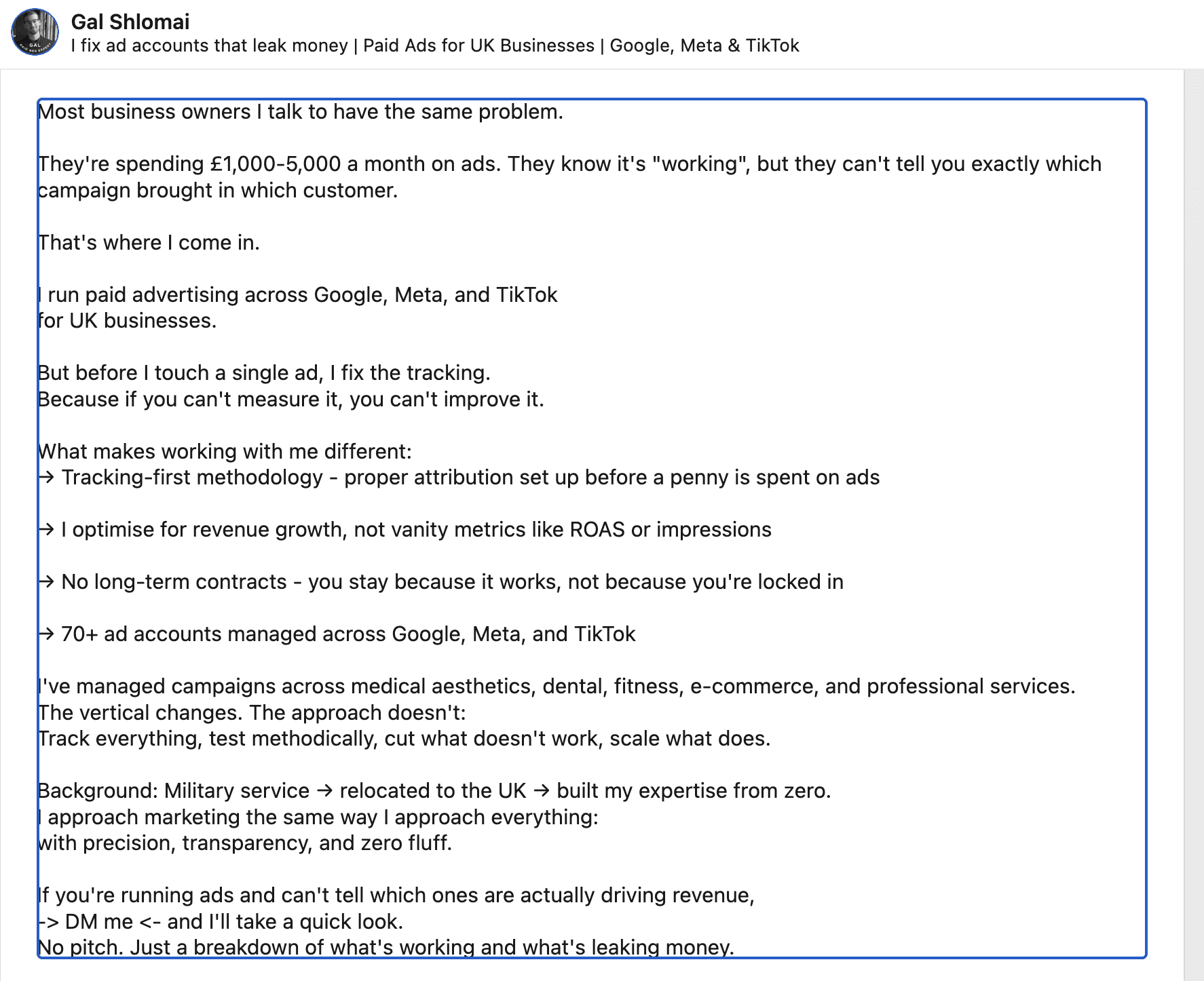
פתיחת אודות, לפני: ״Most business owners I talk to have the same problem. They're spending £1,000-5,000 a month on ads. They know it's "working", but they can't tell you exactly which campaign brought in which customer. That's where I come in.״
פתיחת אודות, אחרי: ״3 out of every $10 (or shekels) you spend on ads are wasted! Wrong audience, broken tracking, ads optimizing for the cheapest click instead of the paying customer. Most business owners never see it, because the dashboard still says it's "working." That's the gap I close.״
הפתיחה הישנה לא הייתה רעה, היא פנתה לקורא ולא לגל, וזה כבר יותר ממה שרוב האנשים עושים. ההבדל הוא בחדות: במקום ״יש להם בעיה״ מגיע מספר (3 מכל 10 דולר, או שקלים, וזאת הקריצה הראשונה לקהל הישראלי), ואז שלוש סיבות קונקרטיות שבעל עסק מזהה מהחשבון שלו. ״הדשבורד עדיין אומר שזה עובד״ זה המשפט שעושה את העבודה, כי הוא מתאר בדיוק את הרגע שבו הקורא נמצא.
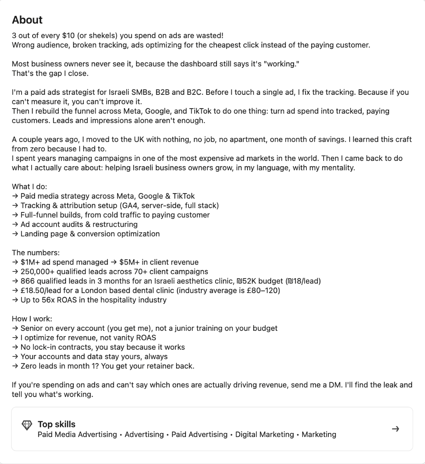
ומה יש אחרי ״ראה עוד״: הסיפור האישי (עבר לבריטניה בלי כלום, למד את המקצוע כי היה חייב, ניהל קמפיינים באחד השווקים היקרים בעולם, וחזר לעבוד עם ישראלים ״בשפה שלי, במנטליות שלי״), רשימת שירותים, מספרים עם הקשר (866 לידים ב-3 חודשים לקליניקת אסתטיקה ישראלית בתקציב 52 אלף ש״ח, ₪18 לליד) ותנאי העבודה, כולל ״אפס לידים בחודש הראשון, הריטיינר חוזר״. המספרים הם של גל, מהחשבונות שהוא ניהל, ואני מציינת את זה כי ככה זה צריך להיראות: מספר, לקוח, תקציב, תוצאה, לא ״הכנסות של מיליונים ללקוחות״ בלי שם ומספר. שימו לב שהמספרים ירדו מהבאנר ונכנסו לאודות, איפה שיש מקום להסביר אותם.
סקשן Services: הגרסה הישנה פתחה ב-״I help UK businesses stop wasting ad spend״ עם סף של £1,000 בחודש. הסקשן הזה עדיין בעדכון, ואני מזכירה אותו כי זה הדבר שהכי קל לשכוח: כשמשנים קהל בכותרת, כל סקשן שמזכיר את הקהל הישן צריך להשתנות באותו יום, אחרת הפרופיל מדבר בשני קולות.
מה לא השתנה: המיקום. ניוקאסל נשאר בפרופיל, והקהל ישראלי. זה סימן שהפרופיל בנוי סביב מי שקונה, לא סביב איפה יושבים.
דוגמא 2 (להמחשה): מייסד סטארטאפ סייבר pre-seed
יובל, בוגר יחידה טכנולוגית, בונה מוצר להגנה על API ומגייס סבב ראשון. הפרופיל שלו צריך לעבוד על שני קהלים בו זמנית, משקיעים ולקוחות ראשונים, וזה בדיוק המקום שבו רוב המייסדים נופלים לכותרת של ״Co-Founder & CEO, Stealth״.
כותרת, לפני: Co-Founder & CEO at [Startup] | Cyber | Ex-8200
כותרת, אחרי: API security for fintechs that just passed their first pentest | Co-Founder & CEO | Ex-8200
הלקוח (פינטק), השלב (אחרי פנטסט ראשון, כלומר יש להם כבר כאב) והמוצר (הגנה על API). המילה ״סטלת׳״ נעלמה, כי סטלת׳ לא מביא שיחות. והכותרת נשארת באנגלית, כי הקהל של יובל, CISO בפינטק ומשקיעים, חי באנגלית, בדיוק הכלל מדוגמא 1.
פתיחת אודות, לפני: ״יזם סדרתי עם תשוקה לאבטחת מידע. מוביל צוות של מהנדסים מהטובים בישראל.״
פתיחת אודות, אחרי: ״רוב חברות הפינטק שאני מדבר איתן מגלות את הבעיה ב-API שלהן מהפנטסט, לא מהמוצר. אנחנו בונים את השכבה שתופסת את זה קודם. אם אתם CISO או VP R&D בפינטק וזה נשמע מוכר, אשמח לשמוע מה מצאו אצלכם.״
בפתיחה כזאת המשקיע רואה תזה ברורה, והלקוח הפוטנציאלי רואה את עצמו. הרזומה של יובל (היחידה, החברה הקודמת) יושב בסקשן הניסיון, במקום שבו מי שרוצה לבדוק ימצא אותו.
תמונת רקע: צילום מסך מטושטש של דשבורד המוצר עם משפט אחד עליו, ״שכבת ההגנה שתופסת את זה לפני הפנטסט״.
סקשן Featured: פוסט הדעה שהביא הכי הרבה תגובות (פוסט על למה פנטסט שנתי הוא לא אסטרטגיה), דף ״בקשו דמו״, והרצאה של 12 דקות במיטאפ.
דוגמא 3 (להמחשה): עצמאי שמוכר שירות לחברות, יועץ תמחור
אורי בנה 6 שנים מודלים של תמחור בחברת SaaS גדולה ועכשיו עושה את זה כפרילנסר לחברות בשלבים מוקדמים. כאן הדוגמא קצרה, כי הדפוס כבר ברור.
כותרת, לפני: Pricing Consultant | Freelance | Open to projects
כותרת, אחרי: Early-stage SaaS pricing: finding the money your Pro plan leaves on the table | 6 years of pricing at a public SaaS
גם כאן אנגלית, קהל ה-SaaS חי בה. מה שהשתנה זה המבנה: הלקוח, מה מוצאים בשבילו, וההוכחה בסוף.
פתיחת אודות, אחרי: ״כמעט כל סטארטאפ שאני פוגש מתמחר לפי המתחרה, ולמתחרה אין מושג מה הוא עושה. אני יושב עם הנתונים שלכם שלושה שבועות ויוצא עם מודל, לא עם מצגת.״
סקשן Featured: מחשבון פשוט להורדה, פוסט קרוסלה על שלוש טעויות תמחור, ודף ״איך זה עובד״.
הדפוס בשלוש הדוגמאות זהה: הכותרת מתחילה בלקוח, פתיחת האודות מתחילה בבעיה שלו, וה-Featured מוביל למקום אחד ברור. תכל'ס, זה כל הסוד, והוא לא סוד.
תמונת רקע לינקדאין: המידות הרשמיות ומה לשים בה
לפי מרכז העזרה של לינקדאין, המידה המומלצת לתמונת הרקע (הם קוראים לה cover image) היא 1584 על 396 פיקסלים, קובץ JPG או PNG, במשקל מתחת ל-8MB. הם גם מוסיפים שאם התמונה יוצאת מטושטשת, שווה להעלות קובץ גדול יותר, ושצילומים נראים טוב יותר מתמונות עם לוגו (LinkedIn Help). היחס הוא 4:1, רצועה רחבה ונמוכה.
מהניסיון שלי, שני דברים משבשים את רוב הבאנרים. הראשון הוא תמונת הפרופיל העגולה, שיושבת על הרקע ומכסה חלק מהפינה התחתונה בגרסת הדסקטופ, אז טקסט שמונח שם נבלע. השני הוא המובייל, שחותך את הקצוות, אז מה שחשוב צריך לשבת באמצע הרצועה. הדרך הכי מהירה לבדוק היא להעלות, לפתוח את הפרופיל מהטלפון, ולראות מה נשאר.
מה שמים ברקע? משפט אחד, אותו משפט מהכותרת או גרסה קצרה שלו, ואולי הוכחה אחת (לוגו של פודקאסט שהתארחתם בו, שם של כנס, מוצר). מה לא שמים: מספר טלפון, כתובת מייל (זה מזמין ספאם ולא לקוחות), ורשימה של שבעה שירותים. אדם שמגיע לפרופיל צריך להבין תוך שלוש שניות מה יש לו להרוויח מכם, והבאנר הוא השלט מעל הדלת.
ודווקא כאן AI עוזר. תמונת רקע נקייה בפלטת המותג עם משפט אחד היא עבודה של עשר דקות בכלי ייצור תמונות, ואין סיבה להישאר עם הנוף מיוון עוד שנה.
ככה נראים באנרים שעובדים, שתי דוגמאות מתוך האוסף שאני מלמדת ממנו בקורס הלינקדאין שלי:
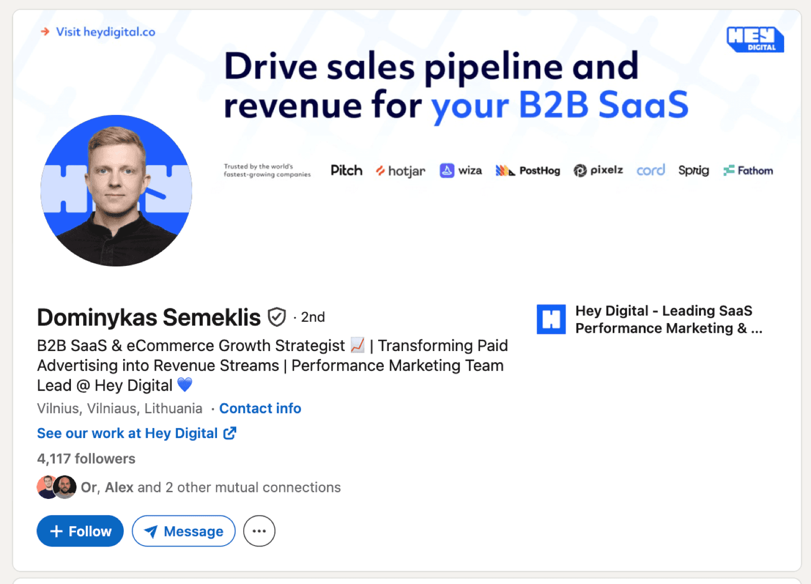
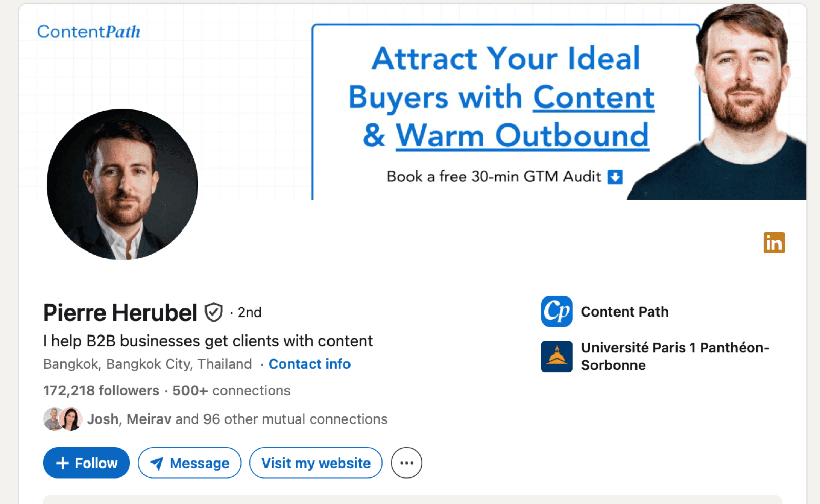
בראשון הצעת ערך ושורת לוגואים של לקוחות, בשני משפט אחד וקריאה לפעולה. במרחב המוגן של הקורס יש כלי שבונה איתכם את טקסט הבאנר שלב אחרי שלב, כולל פרומפט תמונה מוכן, ועוד אוסף שלם של באנרים כאלה עם פירוק של למה כל אחד עובד.
מה עושים השבוע
הסדר חשוב, כי כל שלב מקל על הבא:
כותבים כותרת חדשה ובודקים איך 60 התווים הראשונים נראים בתגובה ← מחליפים תמונת רקע ב-1584×396 עם משפט אחד ← כותבים מחדש רק את 300 התווים הראשונים של האודות, מהבעיה של הלקוח ← בוחרים שלושה פריטים ל-Featured, כל אחד עם יעד ברור ← פותחים את הפרופיל מהטלפון ובודקים מה נחתך.
הערה על AI: אם נותנים ל-ChatGPT לכתוב את האודות, יוצא הטקסט שכולם מזהים ממטר, ולינקדאין עצמה כבר מסמנת אותו (כתבתי על כפתור ה-AI slop באוגוסט). הכלי טוב לחיתוך, לניסוחים חלופיים ולבאנר, פחות לקול. על החלוקה הזאת, מהירות של AI וקול של בן אדם, יש מאמר שלם על וייב מרקטינג ל-B2B.
השורה התחתונה
פרופיל לינקדאין לדוגמא שמביא לקוחות מתחיל תמיד מהלקוח, בכותרת, ברקע ובשתי השורות הראשונות של האודות. כל השאר, התארים, היחידה, 15 השנים, נשאר בפרופיל, רק זז למטה. אפשר לעשות את זה לבד בערב אחד עם הרשימה למעלה, מי שרוצה ללמוד את השיטה המלאה, כותרת, באנר, אודות, פוסטים, ימצא אותה בקורס הלינקדאין שלי. ומי שמעדיף שמישהי תעשה את זה איתו, זה בדיוק מה שאני עושה עם עצמאים ומייסדים.
אז שאלה לסיום: אם קונה פוטנציאלי היה רואה רק את 60 התווים הראשונים של הכותרת שלכם, בלי השם ובלי התמונה, היה מבין מה יש לו להרוויח?
על הכותבת: חניתה יודובסקי, מנהלת מערכי לינקדאין של חברות B2B, מהפרופיל של המנכ״ל ועד תוכניות שגרירים לעובדים, ומלווה עצמאים לבניית הנוכחות שלהם בלינקדאין. לינקדאין היא המגרש שאני עובדת בו כל יום, וסוכני AI וכלים שאני בונה בעצמי הם דרך העבודה. עודכן: אוגוסט 2026.
מקורות: LinkedIn Help, Add or change the cover image on your profile · Meltwater, 9.5M AI citations study · Metricool, 2026 LinkedIn Study press release · Metricool, LinkedIn Trends 2026 · AuthoredUp, LinkedIn character limits